Icehouse
Services
- Brand Development
- Graphic Design
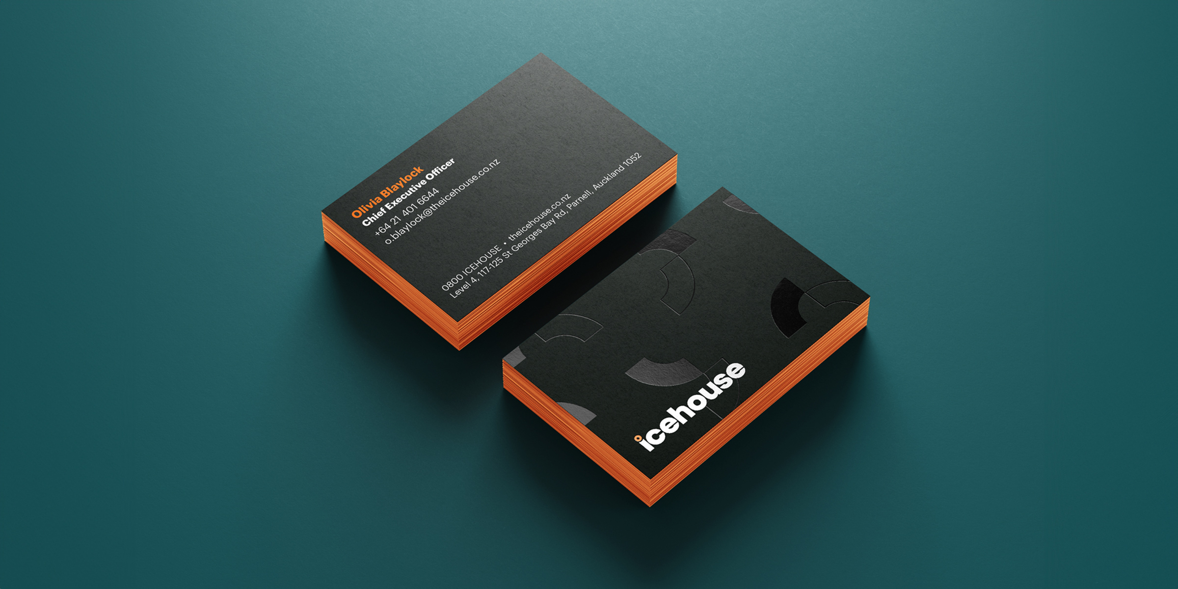
A brand refresh for the team at the Icehouse, who have been helping kiwi businesses succeed and grow for over 20 years.
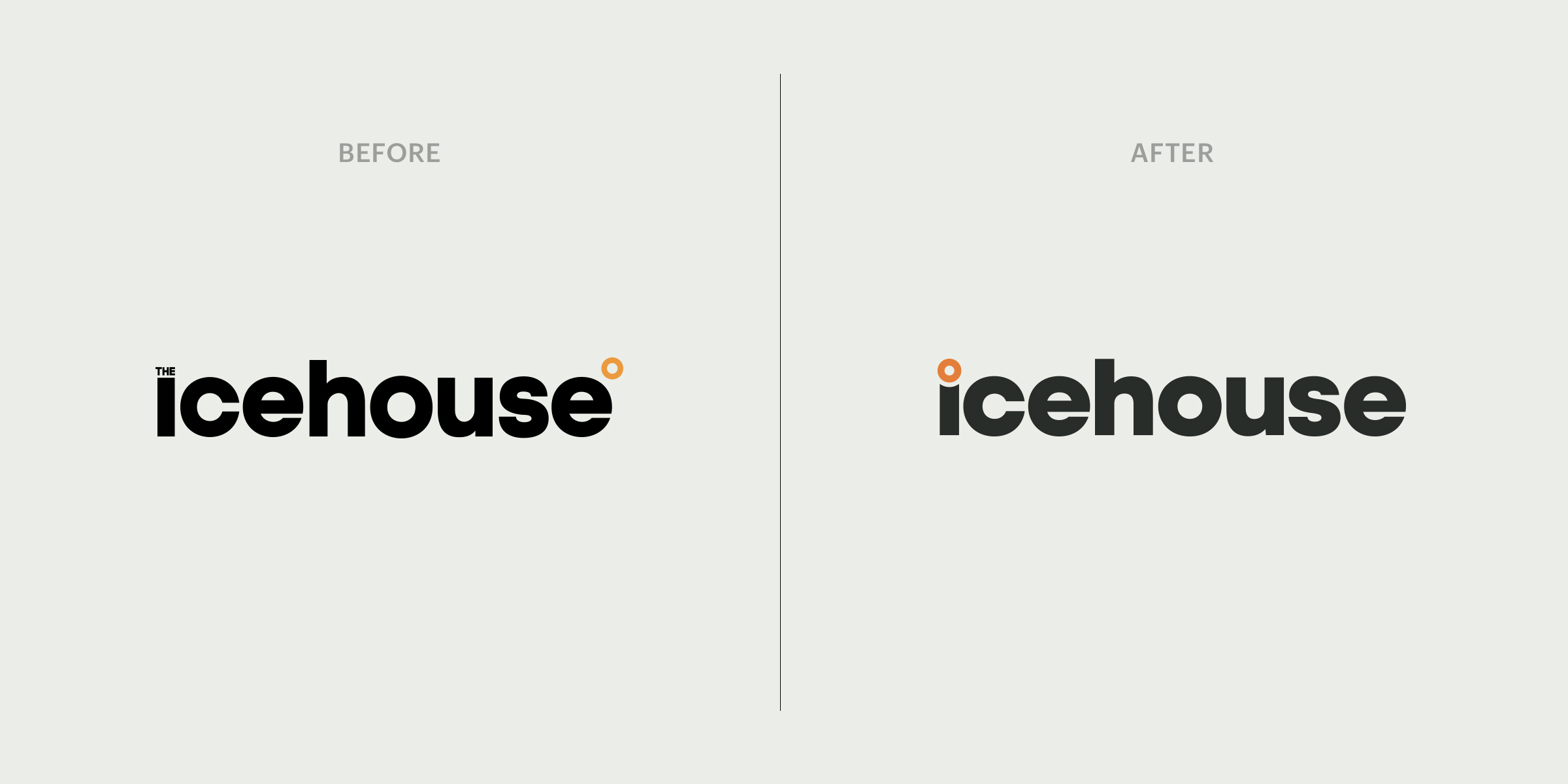
We retained the original typography to maintain brand recognition, and focused on repositioning the orange ‘donut’ instead to help create better visual balance. By placing it at the start of the word, it doubles as the dot of the ‘i’ and anchors the entire design – solving a key visual issue at the same time.
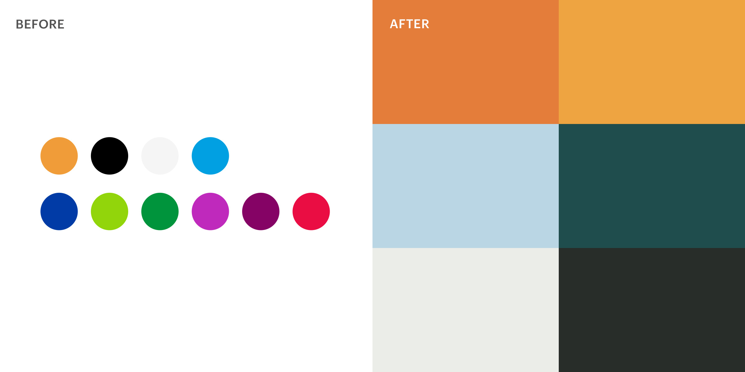
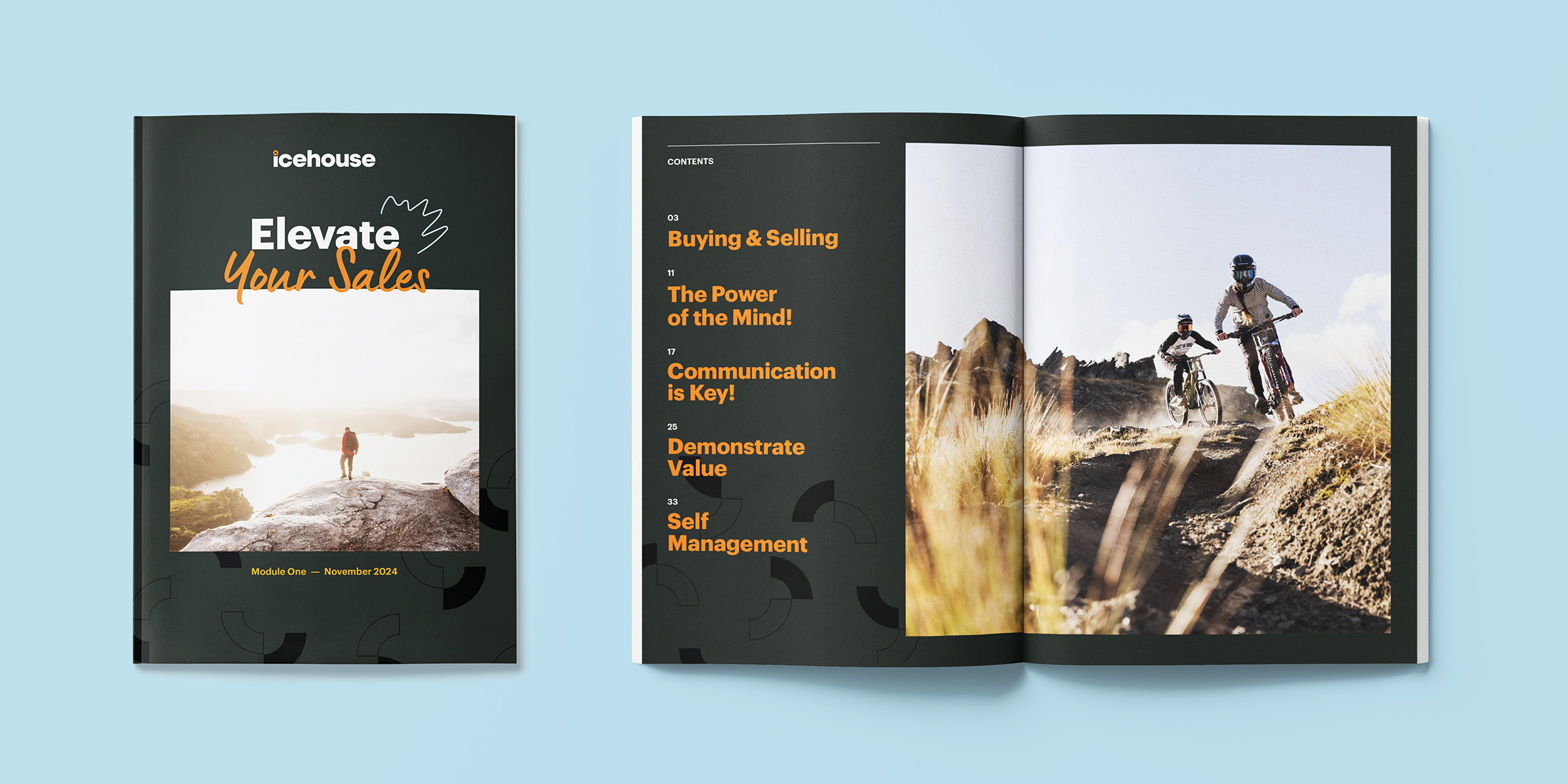
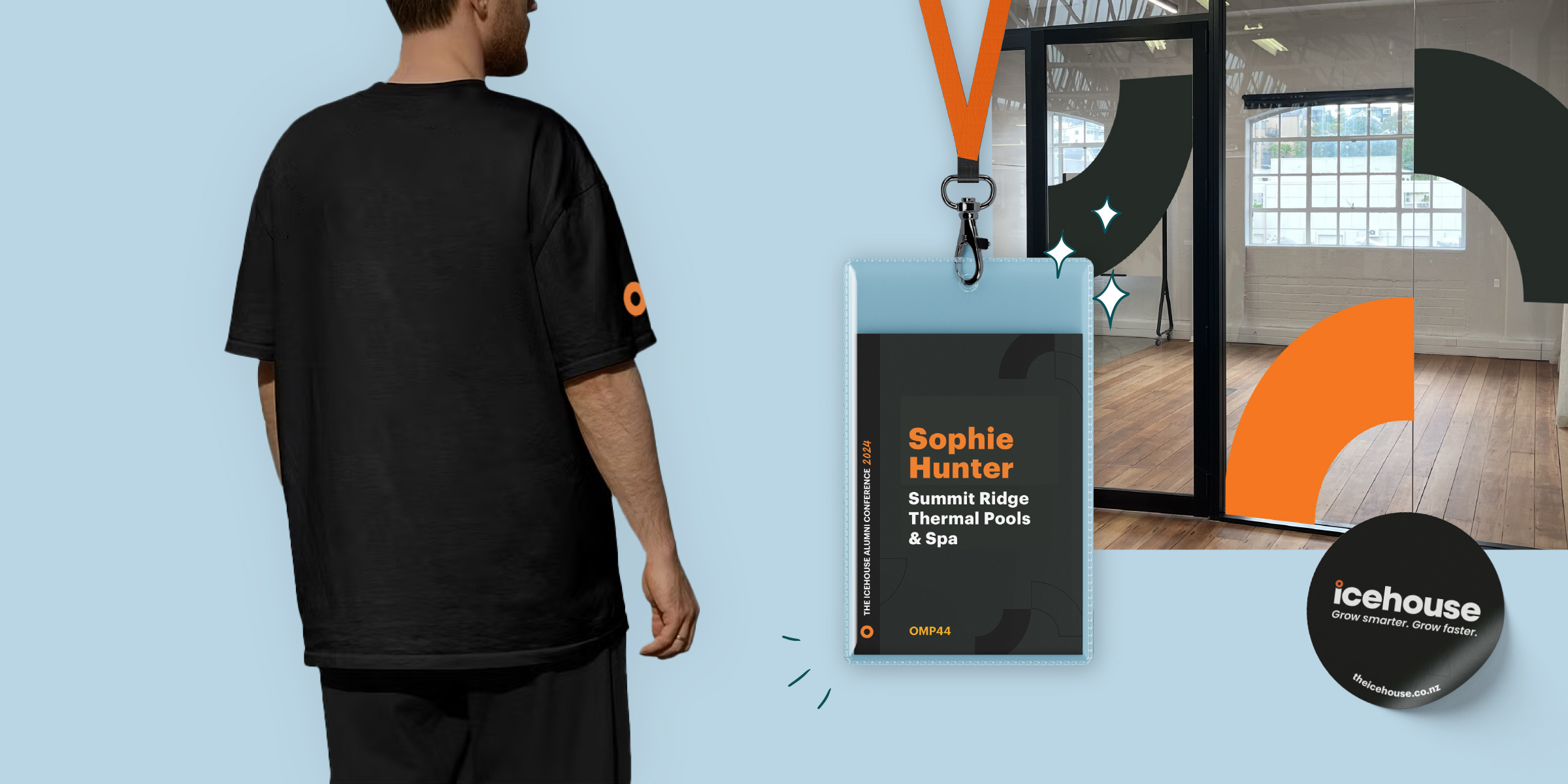
The brand is modernised through the introduction of a handwritten font that brings a personal touch, some hand-drawn brand elements, a pattern that’s based on the ‘donut’ mark, and a brand new colour palette that is centred around the brand orange.


